Mobile website design has evolved drastically over the last decade as online consumers continue to abandon their desktops for their smartphones. Statista reports that as of January 2021 there were 4.66 million active internet users, 92.6% of which accessed the internet with their mobile devices. Having a stylish, content driven mobile site has become an essential for B2B and B2C businesses, and has forced the web development community to adapt to better serve their clients.
On top of this, in July of 2019 Google announced that they are now using the mobile versions of websites for indexing and ranking. If your mobile site has fallen by the wayside it could be drastically affecting your Google rankings and organic SEO. In this blog we will cover two different ways to approach designing your mobile site, and how they can help you grow your online marketing efforts.
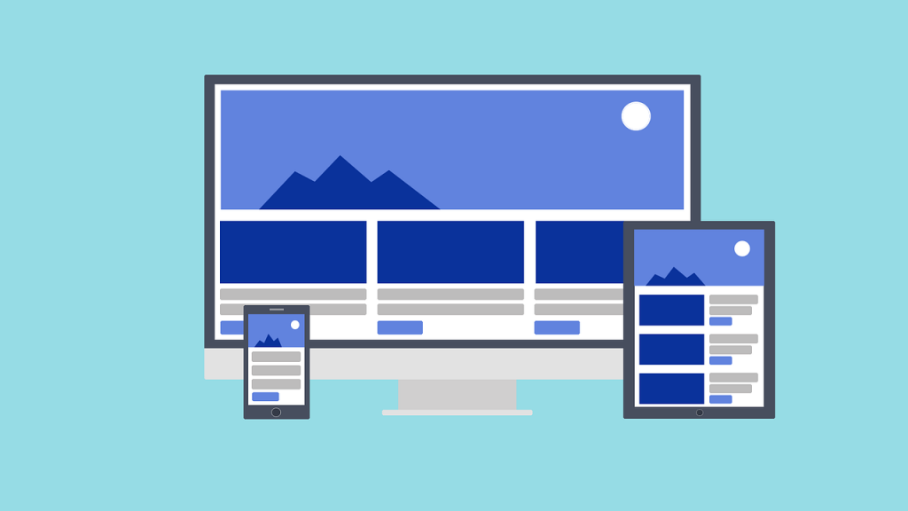
Responsive Design Websites
A mobile responsive design website responds and adapts to the size of the screen the website is being presented on. Website designers typically have four benchmarks that they are designing to: Desktop monitors, laptop monitors, tablets, and smartphones.
When designing a mobile responsive website it is important to be strategic about your content and design so that your website effectively engages users on various screen sizes.
Implementing Responsive Design Websites
Viewport Meta Tag
Responsive design websites are accomplished by placing a viewport meta tag in the header of the website. A browser’s viewport is the area of the window where content is seen, and this tag allows your website to adapt to different screen sizes effectively.
Sizing Your Content
When you are developing a mobile site with a viewport meta tag be sure to develop your content within the size constraints. If any of your content stretches past the constraints your users may be required to scroll horizontally, which could cause them to leave the site. Specifically, images have fixed dimensions, and if it is larger than the viewport it will create a scrollbar.
What is a Mobile First Website?
The Mobile First website design strategy has become increasingly popular as mobile phone usage continues to eclipse desktop usage. Before we get into mobile first, it is important to understand the concept of “Progressive Advancement” and “Graceful Degradation.”
Graceful Degradation
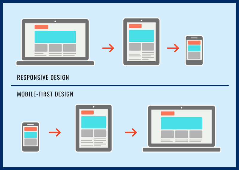
Graceful Degradation means that when you are designing a website you begin with the complex, desktop version, and then make it compatible for mobile use by removing features and content.
Progressive Advancement
With Progressive Advancement you begin your website design on the mobile version of the site with the most basic functions and features. After you complete the mobile version of the site, you build the more advanced version for tablets or PC’s.
As you may have guessed, Mobile First Websites follow the Progressive Advancement style of web design. This style of design has tons of benefits and can help you fine tune your content before you begin the more advanced coding and styling of the desktop site.
Designing the mobile version of your website first forces you to work under screen size and bandwidth constrictions, which causes you to focus on putting your biggest strengths forward and cutting away some of the fluff. Mobile First Website Designs are often content focused, neat, and practically designed. This is especially beneficial in 2021, as about 30% of consumers will abandon their carts in the middle of shopping if they run into issues with a brand’s mobile site.
Implementing Mobile First Websites
Top-Down Approach
When we are developing mobile first websites we like to use a top-down approach during the planning process. A top down approach begins by looking at the big picture, and is then broken down into project segments based on that idea. This allows you to find insights on how the whole website will be formatted so you can develop your segments to match the overall theme.
User Experience
User experience should be one of your main focuses as you develop your mobile site. Identifying pain points in the buying process can allow you to focus on those areas, and tailor the content and design to move customers through those roadblocks. We recently released a blog on User Experience and Customer Journey Maps that will help you complete this process.
Navigating Mobile Constraints
Mobile devices typically have less memory, processing power, and bandwidth than desktops. These mobile constraints should cause you to rethink any fancy animations, graphics, or gradients as you are designing your mobile site. We have outlined some of the more advanced constraints you may run into below.
- Control Mechanisms: When you are designing your site, keep in mind how difficult it can be to type and navigate text boxes on mobile devices. Keep the forms and content simple so navigation is as easy as possible.
- Usage Context: We’ve all been on the couch watching tv while simultaneously scrolling through social media or online retailers. Keep in mind that your mobile site visitors may not be fully engaged in your site, and remove any distractions from the core content you want your visitors to see.
- Updates: Updating mobile sites and apps can be very difficult and time consuming. A constant line of communication during updates is important so developers and marketers are on the same page.
In short, keep it simple!
Similarities Between Mobile First and Responsive Design Websites
While these strategies may seem very different based on what we have written so far, they share a few similarities at their core. The purpose of both of these design techniques is to ensure that your website performs the best it can on any device.
Mobile Coding
Much of the back end coding that is used for responsive design and mobile first websites is very similar.
Media Queries and Breakpoints
Bootstrap is a free and open-source CSS framework that we love using for mobile first and responsive design sites. They have an awesome guide on how to use media queries to create breakpoints, or points where the viewport changes for bigger devices. The query ranges, or breakpoints, they typically use can be found below.
// Extra small devices (portrait phones, less than 576px)
// No media query for `xs` since this is the default in Bootstrap
// Small devices (landscape phones, 576px and up)
@media (min-width: 576px) { … }
// Medium devices (tablets, 768px and up)
@media (min-width: 768px) { … }
// Large devices (desktops, 992px and up)
@media (min-width: 992px) { … }
// Extra large devices (large desktops, 1200px and up)
@media (min-width: 1200px) { … }
Implementing this code may not seem too difficult, but there are often lots of workarounds due to device or browser constraints. Be sure to do your research and regularly test your code to make sure it is cooperating well with different device sizes and browsers.
Differences Between Mobile First and Responsive Design Websites
Website Design
The biggest difference between mobile first and responsive design websites is the design process. As we stated earlier, responsive design websites begin with the desktop version of the website, while mobile first begins with the mobile design.
Target Audience
We will start this section with a disclaimer. Traditionally your target audience has affected the decision to do responsive design or mobile first, but with more and more people using mobile you may want to take this with a grain of salt.
Typically, B2B websites are meant to be more informative, and users are more likely to use desktop versions. This has caused B2B companies to lean towards using responsive design as they put together their websites.
On the other hand, B2C has been dominated by mobile users for over 5 years. Most of your favorite retail websites were developed mobile first, why not play to your target audience?
SEO Optimization
As we mentioned earlier, Google now uses the mobile version of websites as they index and rank. While responsive design websites can be very effective, the best way to ensure your website ranks on Google is to design mobile first.
Which Style is right for you?
As you may have gathered during your reading so far, mobile first websites are quickly becoming web developers’ first choice as they put together their clients’ websites. We mentioned a statistic earlier in the post that 92.6% of internet users are using their mobile device. 92.6%! This, on top of Google’s decision to index mobile sites first makes having an efficient, content driven mobile website more important than ever.
While the traditional responsive design approach can yield positive results, the mobile first approach seems to be the way to go as this will be most viewers’ first experience with your site. 10 years ago when the majority of website users were on desktop, it made sense to start by making a beautiful desktop site. Shouldn’t the same be true now that over 90% of internet users are on mobile devices?